How to Create a Dark Theme
The world is getting crazy about “Dark Mode”, and so are we. You can see “Dark Theme”, “Dark Mode” toggler at almost any modern site and application now. Should we install it to ours?
What is Dark Mode?
Dark Mode, or Dark Theme, actually is a bunch of CSS style rules, and is activated when users toggle a button, so that all these rules will be applied. Certainly we can build our site without the presence of Dark Mode, but giving another UI option to users is always welcome. Moreover, a dark screen also brings less eye strain than a bright one. We just need to setup everything methodically.
Setup Dark Mode/Theme:
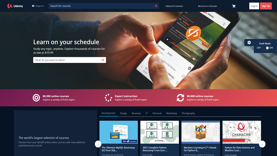
Today we will imitate Udemy’s Dark Theme. Udemy used to have the Dark Mode option, but its web design has changed recently. Last year when I created a Udemy landing page, I did introduce Dark Mode to that mockup.
Generate a HTML Element:
We definitely need to add a ‘sidebar’ element to our html file. It can be anywhere but ideally I put it right above our <header> tag.
<div class="sidebarMini">
    <button class="sidebarMini--btn">
      <i class="fa fa-cog"></i>
    </button>
    <div class="sidebarMini--content">
      <h2>
        Dark Mode
      </h2>
      <div class="d-flex">
        <span>OFF</span>
        <label class="switch" for="checkbox">
          <input type="checkbox" name="" id="checkbox">
          <div class="slider"></div>
        </label>
        <span>ON</span>
      </div>
    </div>
  </div>
  <header>...</header>
The button hasn’t changed anything yet. Now it’s time to set its behaviour when users toggle it.
Append to our main JS file:
const sidebarMini = document.querySelector('.sidebarMini')
const toggleBtn = document.querySelector('.sidebarMini--btn')
const switchBtn = document.querySelector('#checkbox')

toggleBtn.addEventListener('click', () => {
  sidebarMini.classList.toggle('is-opened')
})

switchBtn.addEventListener('click', () => {
  document.querySelector('body').classList.toggle('darkMode')
})
Final Touch:
Now it’s time to add dark colour of every components to all your stylesheet files. I use SASS/SCSS since I love the way it helps me manage my styles, but CSS or CSS modules work just fine.
Tweak our CSS/SCSS files:
My SCSS folder management:
UdemyMockup
├── sass                       # Main SCSS folder
|  ├── Base
|  |  └── _customise.scss      # customisable styles of libraries, frameworks
|  |  └── _reset.scss          # normalise css file

|  ├── Components
|  |  └── _button.scss         # styles of all page buttons
|  |  └── _card.scss           # card, like Bootstrap card component
|  |  └── _carousel.scss       # Owl Carousel library styles
|  |  └── _sidebarMini.scss         # Sidebar that controls Light/Dark theme
|  ├── Helpers                 # _extend.scss, _mixin.scss and _variables.scss
|  ├── Layouts                 # all components of the page: banner, footer, header..
|  ├── Pages                   # Different pages with distinguished styles
|  ├── Theme
|  |  ├── Dark                 # Where we include all dark colour to all layouts, components: _buttonDark.scss, _cardDark.scss
|  ├── Vendors                 # Third-party libraries, styles go here
├── main.scss                  # main file, use SASS compilers to convert to CSS, or use node-sass
This part, we need to touch all components, or layouts that require dark colour, an example of this:
// _variables.scss
//*Dark Theme
$color-dark-0: #152e4d;
$color-dark-1: #061325;
$color-dark-2: #344050;
$color-dark-3: #9da9bb;
$color-dark-4: #0e1c2f;
$color-dark-5: #d8e2ef;
$color-dark-6: #132238;

//*font-size
$fs-1: 13px;

//*font-weight
$fw-1: 600;

//*padding
$pd-0: 10px;
$pd-2: 5px;

// _buttonDark.scss
.darkMode {
  .btn--white {
    &:hover {
      @include hoverButton($color-dark-5, $color-dark-0, $color-dark-2);
    }
  }
  .btn--red {
    &:hover {
      @include hoverButton($color-white-0, $color-red-2, $color-red-2);
    }
  }

  .btn--dropup {
    @include styleButton($color-dark-5, $color-dark-0, $color-dark-2, $fs-1, $fw-1, $pd-2 + 1, $pd-0);
    &:hover {
      @include hoverButton($color-dark-5, $color-dark-6, $color-dark-2);
    }
  }
}
After editing all the components, now whenever we toggle the mini sidebar, the class .darkMode will be added to all those html tags, and literally our site can go back and forth in Light/Dark theme.
Leave a comment